If you've never read a Bret Victor paper or watched a Bret Victor presentation you're missing out. For paper's I'd recommend starting with Learnable Programming.
Recently via some random chain of events I stumbled on the Future of Coding podcast. The theme I guess could be summed up as "we're doing it wrong!". "It" being programming computers. I don't know if it's true that we're doing it wrong but it's definitely fun to think about.
In a couple of the podcasts the Bret Victor paper, Magic Ink, was brought up. I hadn't read it yet so I checked it out.
It's inspiring as usual for Bret Victor. I'm not sure if I can do a good job of summarizing it but my take away was that with only a little extra thought it becomes clear that lots of software could have far better user experiences.
Bret claims that interface designers should consider themselves graphic designers first and foremost and that a graphic designer's skill is supposed to be to make images and make it easy to understand and compare information as easily and quickly as possible. Many software applications have given little to no thought about what the user actually wants to accomplish, what data they need to see and how to present it for the app to be useful to them and how most apps make it tedious to get what the user really wants out of them and that maybe with a little more thought much of that could be fixed. I really liked that idea and many of the examples were very compelling.
The paper was written in or around 2005 so before nearly everyone had a PDA in their pocket like they do now. Of course lots of people did have PDAs on them in 2005 but internet access over cellular was still rare and expensive.
In any case I'm curious about some of the things that seem to have changed in the 13 years since that paper was posted.
I think probably the biggest example of something that sounded like a good idea at the time and maybe still is but it's probably not as clear.... Much software could be better if it took context into account. That much is somewhat obvious. One example given might be what a map like Google Maps shows you when you open it. If it can know your location it should probably start with a map of where you currently are. If you click the search bar maybe it should try to guess where you're most likely to want to go as possible suggestions like if it's 8am on a weekday maybe it would suggest your work or if it's 6pm on a weekday maybe it should suggest your home. There was a time when maps didn't have GPS data so they couldn't start by showing you where you are. I'm not sure even Google Maps looks at your location and the time of day and what day of the week to decide what options to show you when you click search.
Bret went on to suggest that if all apps communicated with each other then let's say you just read an email about a business trip you need to take. If you opened your maps app now and the email app and the maps app could talk to each other then there should be a way for the map app to guess that maybe what you want to look at right now is the location of the business trip.
Not sure that's a good suggestion BUT, in 2018 the idea that multiple apps would all share their data sounds super scary because we know now that every app would record everything, send it to their servers, share it with their various partners, most of them advertizing partners and we'd all have profiles built on us. Of course we have that today but not to the level that the paper was hoping to see in the future of 2005.
I'm really curious if Mr. Victor still sees that world as a possible future or if he's settled that it's impossible to do without too many privacy issues or if he's got ideas for solutions.
Another example of something that seems to have changed, the paper suggests using context to help searches. I wish Google did this (or did it better). One example in the paper is if you search for "Blender", "3DSMax", "Modo", and then search for "Maya" it should be abundantly clear that you mean "Maya" the 3D Software Application by Autodesk and not "Maya" the civilization from Central America.
I find these context mistakes infuriating, especially when I know the application has the data it needs. Sometime in 2012, while in Tokyo, I searched for "pizza" on Google Maps and it ended up showing me some place in Texas. Given it knew my GPS and even if it didn't know it at the moment it new my previous searches it seems really stupid to somehow think I was searching for anything in Texas without explicitly typing "Texas" in my search. Even typing "Texas" in my search doesn't seem like it should show me Texas USA if I'm in Tokyo as I could be looking for a store called "Texas" or a restaurant serving "Texas BBQ" or "Texas style Mexican food". It seems like it should require some pretty specific extra context for it to ever give me any results from the state of Texas if it knows I'm currently in Tokyo.
In any case though, of the problems I have with context based interfaces is inconsistency. In Google search maybe it's not so bad to get different results each time. Things change, there's new info that matches the search. But, there are time when I feel like consistency trumps context. I'm trying to think of a good example but until then I guess the way I'd explain it is I have muscle memory. Click this option, press down 3 times, press enter to select. Or click here to make a new fob, then click 2 inches to the right to set the fob's options. If a context aware app made it so my muscle memory failed often I think it would drive me nuts.
Not quite the same but an example in the paper is typing a zip code and having the app start zooming as digits are entered. Type a "9" and we know it's the west coast, followed by a "4" brings us to the SF Bay Area, followed by a "5" brings us to the Easy Bay.
That sounds great except ... is it? Maybe it's a different case but Google tried live search results. As you'd type each letter Google would change the results live on the page. Google since got rid of that feature. I'd be curious to know why. The claim is that it wasn't good for mobile so why not make it consistent. I'm not sure I buy that claim as all kinds of things are different on mobile. For one I don't have a mouse with 1 or 2 buttons that can hover over things and I have a tiny display.
In any case though I absolutely loathed the old "show them as you type instant search results". Let's make it clear, I'm not talking about the search suggestions that appear just below the search input area. I'm talking that Google used to update the entire page as I typed. The problem for me is I'm often referencing things on the page as I type. With Google making them disappear I couldn't reference them and it actually made this harder for me.
Given that I wondered if similar issues would happen with things suggested in the paper related to instantly showing new info as the user starts entering their data. I think I'm pretty glad Google Maps doesn't jump around as I type but waits for me to select something. I'm curious if others have noticed that too that trying to be too responsive can actually be annoying and or counter productive.
The last potion of the paper was about his award winning Bart app that ran as an accessory on MacOS. He went over in detail all the design decisions and it was certainly a beautiful app with lots of thought and care put into the design.
My personal reaction though was not quite as awe struck and it made me wonder if "Bart" wasn't also the product of a personal bubble.
The first thing that stuck out was it had this semi-fancy interface for choosing a destination in which it shows a map of the entire Bart system. The Bart system is not really that big. There are basically 5 lines, they all come out of Oakland so it's an extremely simple system. You could hover your mouse down the tracks to choose any station.
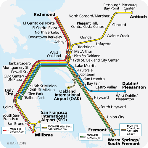
Compare to Tokyo where I live there are something like 40 lines and 2000 stations. Most of the line cross other lines, sometimes multiple times zig zagging here and there. Such a UI would arguably never work here.
![]()
But, thinking about it more at almost seemed like Mr. Victor missed is own advice. The paper points out that often software isn't helping the user do what they actually want to do and the Bart app is a perfect example of exactly that. No one is trying to get from one Bart station to another. They are actually trying to get from one place to another neither of which is a Bart station!
If I'm at the north side of Lake Merritt in Oakland and I want to go to the Metreon in San Francisco my goal is not to "take the Bart". It's to get from where I am to where I want to be. That might be bus, Uber, Lyft, Ferry, Bart, maybe even some carpool service.
That idea came up because the paper mentioned showing only one route and that clearly wouldn't work in Tokyo where there are often multiple routes. There's the fastest route which could depend on the time of day. There's the route that gets you to your destination soonest which might be different. In other words, if you leave right now one route might get you there 50 minutes from now. Another route might get you there 60 minutes from now but you leave 15 minutes later so only 45 minutes travel time. Yet another route might require less transfers, less walking either to the bus stop or train station or at transfer area. One route might take the bus, another a train. One route might be cheaper via more trips on the same company's lines instead of switching companies. There are at least 10 different train/subway/lightrail companies in Tokyo.
From my own apartment downtown I'm only about a 2-3 minute walk to a bus stop but when I ask how to get somewhere, depending on where it is it might be best for me to walk to one of the 5 stations within a 25 minute walk. If it's 5am and I'm planning to go to the beach there is no bus running so I need to walk 15 minutes to a major station where as at 7am its much faster to catch the bus to that station.
As another example from Shibuya to Azabujuban there are at least 4 routes.
- Ginza Line -> Odeo Line
- Hanzomon Line -> Odeo Line
- Yamanote Line -> Namboku Line
- Bus
Why would I pick one over the other? Well, Ginza line and Hanzomon Line run parallel but their platforms in Shibuya are 5-6 minute walk apart. If I'm nearer one or the other I'd pick the one I'm nearer. Hanzomon Line also skips one station so it might be faster. I have a similar dilemma at my destination as the Oedo platform and Namboku platforms are also 5-6 minutes apart so I might want to take into account my final destination. Another concern would be if I have a commuter pass then one of those routes might be free or 1/2 free. Yet another price consideration is even if I don't have a pass the bus is the cheapest option as it's one bus where as the 3 other routes each use two diferent train companies. The bus takes 25 minutes where as the train routes only take 12-15 minutes but, the bus starts at Shibuya so I'm almost guaranteed to have a seat. If I have the time I might perfer a comfortable seated ride in the bus vs standing on the train and having the 2-3 minute transfer walks. Yet another consideration would be if I'm carrying something heavy like if I just bought something maybe I'd prefer a cab/uber/lyft.
This all gets even worse if my destination is between stations. For example from my house to Enoshima, an island a little over an hour a away, I can go
- Bus -> Shibuya -> Shonan-Shinjuku Line -> Enoshima Line
- Bus -> Shibuya -> Shonan-Shinjuku Line -> Enoshima Monorail
- Walk (10 mins) -> Shinsen -> Inokashira Line -> Odakyu Line -> Odaku Enoshima Line
Considerations? The last one is cheaper by $3. ($9 vs $12). The monorail might be more scenic. On the Shonan-Shinjuku line I can pay an extra $9 and get a fancy comfortable airplane like seat for 40 minutes of my trip.
The Bart app's one route design struck a cord knowning it wouldn't work in Tokyo which after a little thought made it clear it wasn't following its own suggestion and solving the actual user's problem of getting from A to B where A and B are not "Bart Stations".
In any case the paper is still amazing and thought provoking and you should totally read it and take away the bigger message. I'd love to hear your thoughts.