Most people get used to one and hate the other. I hate both.
My history with these devices is as follows. I had an iPhone3 in 2008. I
busted it in frustration in September 2009. I was going to get a new one but I
was given a free Nexus−One in December 2009 so I held off. In December
2010 I was given a Nexus−S. In December 2011 I was given a Galaxy Nexus.
Now I just recently bought an iPhone4S. In December 2010 I also purchased an
iPod Touch, the retina display version. Also from July 2010 I had an iPad1. The
point of all this history is that unlike many people who have only briefly used
one system or the other since I've used both systems for years. I hate them
both.
What I hate about iPhone:
The lack of freedom the bugs crap out of me. It's not the freedom perse. It's
the things an iPhone should be able to do but can't because of that lack of
freedom. I could live with it if Apple provided enough ways around those
limits.
An Android an app can pretty much do whatever it wants. Nearly everything in
the system is replaceable. Don't like the home screen? Install a new one. Don't like the virtual keyboard? There are several to pick from.
There are arguably reasons you'd want to do this even on iPhone. I think something like slidescreen is a reasonable UI someone would want to be the default on their phone. I'm
sure there are lots of other innovative ideas out there but we'll never see
them on iPhone.
Some of the other things this lack of freedom prevents:
Apps can't download data in the background
There are podcast apps on both Android and iOS. The android ones AUTOMATICALLY download new podcasts periodically because they can run in the background. They set a timer, the OS wakes them up periodically and they check if there are new podcasts. If there are they download them. Here it is 2012 and iPhone still can't do this because Apple doesn't allow it. WTF!
There are Android apps that sync your photos in the background. Take a photo in any camera app and it's automatically uploaded. Add some new photos to your flickr or facebook or G+ or snapfish and they are automatically downloaded to your phone. In iOS that sync only happens if you run the app. If you happen to be in a coffee shop wanting to show your friends those pictures you posted to flickr last week and you don't have a signal you're S.O.L. If you just got in the car for a long drive and didn't remember to sync your podcasts before you left you have to go without. Those problems don't exist on Android. You shouldn't have to manually sync stuff. It's frikkin 2011. Computers have been doing this kind of stuff for decades.
I'm sure most iOS users plug their iPhone into their mac everyday so they don't perceive this as a problem. I find that argument ridiculous though. There's no reason you should have ever had to plug your iPhone into your Mac EVER! That was a design flaw from the beginning. Have you ever had to plug your laptop into your desktop? I've never once had to plugin an Android into anything except the charging plug.
I'm sure Apple will eventually add some API to make this stuff possible for apps on iOS. It's just that difference in philosophy between the 2 systems. iOS is "only allow apps to do the things we want them to" and they slowly add more things where as Android is "allow apps to do anything and everything where possible a normal computer could do".
Apps can't share files:
Those same restrictions affect other things apps can and can't do. In iOS each app is sandboxed. So, I downloaded Dropbox on my Mac, put a pdf file in it, installed the Dropbox app on my iPad, see it download the pdf file. View it, find out the Dropbox pdf viewer sucks. I download GoodReader only to find out I can't view the pdf file already on my iPad because it's stuck in the Dropbox sandbox. Fortunately GoodReader had it's own Dropbox support. But that means that pdf file is now on my iPad TWICE for no good reason. It also means every app that read external data has to add support for every DropBox like service which means bloat and bugs. Compare to Android where I can use any app to download the pdf an I can use any reader to read it, just like a normal computer.
Those same freedoms make it possible on Android to make an app that will upload any new picture no matter which app is used to take it. So, I can have 1 app that auto uploads to smugmug and then whether I used the built in camera or one of the many effects cameras any picture I take will get uploaded. That's currently not possible on iOS as far as I know.
I'm guessing again, at some point Apple will figure out a solution they are comfortable with allowing apps to share data with each other or put more data in some common storage that all apps can access.
You can't replace built in functionality:
I want a choice in browsers. On Android there are 3 or 4. Opera Mobile, Opera Mini, Firefox and the built in one. You can install a new one and make it the default. Just like the desktop this will eventually lead to competition which ends up promoting innovation and benefits for users. Imagine if somehow Windows oly allowed Internet Explorer. Well, were in that same situation with iOS.
I'm sure most iOS users are happy with Safari on iOS. Are you happy with Safari on OSX? At least 1 out of 4 people is not and uses Firefox or Chrome on OSX. Why? Because they like the features of those browsers over Safari. There are all kinds of missing features that other browser vendors would be more than happy to supply if they were able to install their browsers on iOS machines. Restricting those apps means less innovation on iOS. What if you want a browser that supports WebGL? Or one that supports reformatting webpages for mobile.
The browser doesn't help non-mobile webpages become readable.
A lot of people loved iPhone because it was the first phone they owned that let them browse the *real* web and not just a few mobile sites. That was awesome but reading a website designed for a 1200x1024 computer display on a 480x320 display can be frustrating. Sometimes you have to scroll left and right for every line of some article you want to read. Ugh.
Apple's solution is "reader" mode. For some pages a button that says "reader" which removes all ads and side bars etc. It's a great idea. Unfortunately it has 2 giant problems.
#1) It requires the entire page to load before it starts. That means you often have to sit there waiting for a while before it will let you click the "reader" button. Time you'd rather actually be reading.
#2) It doesn't work on many sites.
Android's browser tackles this a different way. By default it restricts the width of certain elements so that when zoomed the text ends up at a reasonable size and word wrapped to match. For example here is Hacker News on an iPhone4S.
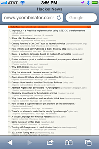 Too small to read IMO. Double tap and the iOS browser zooms in to get rid of the border but it's hardly any more readable.
 Zoom in enough to read and you can only see half of each headline.
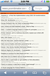
Here's the same webpage on the Android browser. Notice the headlines are word wrapped early. The don't go all the way across the page.
Zoom in enough to read and you can only see half of each headline.
Here's the same webpage on the Android browser. Notice the headlines are word wrapped early. The don't go all the way across the page.
 Double tap and it zooms in to a readable size.
 Sadly, translating from the 300+ dpi displays of both of those phones to a ~75dpi computer screen doesn't really cut it. Suffice it to say that when I switched from Android to iPhone recently I started noticing many of the web sites I read commonly are much harder to read on iPhone because of this difference in browser design.
Of course many sites have a mobile version. Unfortunately in my experience many of the mobile versions of websites are missing functionality which means I almost always look for the "Full Site" link. For example look up "t3i" on Amazon.com. The entire large product description area is missing on the mobile version. Pick "Full site" at the bottom and now you get the nice large description but it's basically unusable on iPhone at any readable size because of the issues above.
Sadly, translating from the 300+ dpi displays of both of those phones to a ~75dpi computer screen doesn't really cut it. Suffice it to say that when I switched from Android to iPhone recently I started noticing many of the web sites I read commonly are much harder to read on iPhone because of this difference in browser design.
Of course many sites have a mobile version. Unfortunately in my experience many of the mobile versions of websites are missing functionality which means I almost always look for the "Full Site" link. For example look up "t3i" on Amazon.com. The entire large product description area is missing on the mobile version. Pick "Full site" at the bottom and now you get the nice large description but it's basically unusable on iPhone at any readable size because of the issues above.
What I hate about Android:
The list is probably larger here but also harder to put into words. The simple answer is Android's user experience is no where near as good as iOS's. The problem here is that for many people this is a subjective judgement. Some examples:
The touch tech on iOS is way better than Android.
On Android, on every device I've used, there has always been spurious touch readings. There are also times I touch and get no response. I don't know how much of this is related to hardware tech issues and how much is related to software tech issues. All I know is that iOS always feels good and always responds well. This isn't just a matter of iOS's UI responsiveness, which is a huge advantage, it's also something about the way iOS decides where you it thinks you wanted to touch. Rarely on iOS do I tap somewhere and have it think I tapped somewhere else. The same can't be said of my experience on Android. It's not awful on Android it's just noticeably worse. It's kind of like touchpads on Macbooks vs every other laptop. The macbooks are butter. Other laptops are usable but the the difference is obvious to anyone that uses both. It would be nice to actually do some kind of statistical analysis to try to figure out what's up.
I have yet to use a virtual keyboard on Android that is as accurate as iOS.
I have no idea why.
There are some virtual keyboards on Android that feature wise I like better than the iOS keyboard. For example Smart Keyboard Pro has a recent word list like many Japanese phones so if I recently typed "Meet me at Starbucks" then next time I type "Meet" it will suggest "me" followed by "at" followed by "Starbucks" with some heuristic on how to suggest. I've missed that feature ever since I left Japan in 2007. I wish 3rd party virtual keyboards were allowed on iOS so innovation could happen there. But, I still have to concede that typing on iOS is better than typing on Android most of the time.
The back button problem
I would argue Android should have never had a back button. I'd like to believe some testing would have pointed this out but clearly it didn't because we're stuck with that damn back button. You can read about this issue all over the net with iOS people saying Android's back button issue is a problem and Android fans defending it.
Here's what I hope is an objective fact about the Android back button. IT'S NOT PREDICTABLE!
The way it worked as of Android 2.3 is that each app has a "stack" of screens. Pressing the back button pops the current screen off that stack revealing the screen below. If there are none you are taken to the home screen. The problem is let's say you start the Messaging app. The first screen is "list" of conversations screen. You pick a conversation and now you are on the "conversation" screen. From the conversation screen you press "back" and you get the "list" screen. Press back again you get the "home" screen.
Now let's take another senario. You are in the browser. You get a notification that you have a new message. You select the notification for the message. You are taken to the "conversation" screen. You press home and do something else, say listen to music. Later you decide you want to send a message to someone. You go the home screen and pick the messaging app. Since the app is still running you see the "conversation" screen. You press back you get the "home" screen. WTF!
In the first case it went "conversation"->"list" in the second case it went "conversation"->"home"
Notice in this case, even if you had an amazing memory and could remember that you happened to launch the messaging app from a notification an hour ago or last night or something you still have no direct way to get to the "list" screen. The only way there is to select the messaging app either from the home screen or the recently used list. You'll get the "conversation" screen. You press "back" and you'll exit the messaging app back to the "home" screen. Now you have to navigate the home screen to the screen that has the messaging app icon on it so you can re-launch the messaging app and have it start in on the "list" screen.
Android 4.0 attempts to fix this by asking people to fix there apps so that if they start at some deeper level (eg. the messaging app starting on the "conversation screen" when launched from a notification) the app should pre-populate its screen stack (eg, put "conversation" screen on the stack even though the messaging app is starting directly on the "list" screen) so that pressing back will take users to a consistent place. Of course the odds that 200k apps will get fixed or that all the developers of Android apps will even notice the suggestion buried in the docs somewhere is highly unlikely. Even Google's own apps are not fixed yet including the most common offender, the Messaging App!!!
iOS avoids this problem entirely by not having a back button. If an app has multiple screens it must put an onscreen button somewhere to switch between them. For example the messaging app in iOS has a "messages..." button to go from the "conversation" screen to the "list" screen. It's always consistent by design.
The hardware is poorly designed
Android's hardware diversity is both a blessing and a curse. The benefit is lots of choice, lots of competition, lots of opportunities for manufactures to add new stuff. Higher res displays. More memory, faster CPUs, more powerful GPUs, better cameras, etc..
I actually don't subscribe to the idea that that most of that fragmentation is bad. Desktop computers have a million different specs. Laptops have a million different specs. Developers have been making apps for those for decades and not bitching about it.
In fact, having used the large Galaxy Nexus for a couple of weeks it's shocking how small the iPhone display feels in comparison.
That said there are several hardware problems for me:
#1) varying button location.
Every new model of Android re-arranges the order of the 4 basic android buttons, back, menu, home, search. It's super frustrating. You have a phone for 1 to 2 years. You get a new one and your muscle memory has you pressing the wrong buttons since they changed the order.
Here are the 4 Android phones from Google. The G1, the Nexus One, the Nexus-S and the Galaxy Nexus. Notice the home button, probably the most pressed button has moved position with every new phone!!!
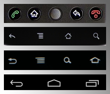 Imagine if every time you bought a new computer the letter keys were in a different order or you bought a new car and the position of gas, break, clutch changed. Yes, eventually you'd get used to it. That doesn't mean it's okay to change the order.
I seriously doubt someone even thought about this. Probably every phone was made by a different designer and with no rules or guidelines each one did their own thing.
#2) touch surfaces that go all the way to the edge
Another problem, at least with the Nexus-One, Nexus-S, and Galaxy Nexus is there is no dead space around the edge of the display or rather that dead space is too thin. This comes up all the time when I handle an Android phone. I pick it up and accidentally exit the app I was just about to use. I set it down and accidentally press a button I didn't mean to press. This has happened daily for me on Android for the last 2 years of use.
Some examples:
I have navigation on in the car. The phone is in a coin area in the center console between the 2 front seats. I try to pick up the phone, if any part of my fingers brushes edges of the display the odds are high it will exit the navigation screen. Especially if it's near the home/back/search virtual buttons. This is especially frustrating while driving because what was going to be a 1 or 2 second interaction with the phone to glance at the display is now a much more involved interaction while I try to get back to the navigation app and pay attention to the road.
I start a game. The phone is being held in portrait mode (tall), I rotate it in my hand to landscape (wide) since most games play in landscape. While rotating my finger brushes the back or home virtual keys and the game exits.
The same thing happens when trying to play a game. There's a virtual button or joypad but if you slide your finger slightly too far you hit the home or back key and exit the game.
These problems rarely if ever happen on iOS because there's enough of a border that it's easy to pick the phone up without accidentally pressing a button and because there are no virtual system buttons. It doesn't help that all 3 of the android phones mentioned above have effectively virtual keys right near the one edge of the phone making them easy to hit. iPhone's design is such that the one physical button is hard to hit by accident and requires a very deliberate press. The phone is thick enough that it's easy to pick up without pressing the screen by accident and there's a enough of a dead space around the touch zone that it's far less likely you'll touch somewhere you didn't mean to just by picking it up or putting it down.
I don't feel like this problem will ever be fixed. It's too subtle to get right for pretty much anyone but Apple. Yea, I know that's a ridiculous statement but one way or another I don't believe Android will ever fix this problem. Either they don't get it, don't care, or they can't get the hardware manufacturers to accept it.
The dev system seems poorly conceived.
I'll admit, I don't know either system that well. What I do know is that the percentage of apps with really bad UIs is far larger on Android than iPhone.
I have to assume this is because of differences in their SDKs. iPhone's SDK makes the path of least resistance for making an app end up with reasonable defaults for UI elements. Android's path of least resistance for making an app clearly makes worse UIs. It's not that you can't make nice UIs on Android, there are plenty of apps that do, it's that whatever the defaults are are passable in the iOS SDK but not in the Android SDK.
This isn't a problem with Android. Rather it's a problem for Android. All other things being equal the more the defaults in an SDK lead to great apps the better the experience of most apps in general will be. Since the defaults on Android are worse the average quality of apps are worse.
Imagine if every time you bought a new computer the letter keys were in a different order or you bought a new car and the position of gas, break, clutch changed. Yes, eventually you'd get used to it. That doesn't mean it's okay to change the order.
I seriously doubt someone even thought about this. Probably every phone was made by a different designer and with no rules or guidelines each one did their own thing.
#2) touch surfaces that go all the way to the edge
Another problem, at least with the Nexus-One, Nexus-S, and Galaxy Nexus is there is no dead space around the edge of the display or rather that dead space is too thin. This comes up all the time when I handle an Android phone. I pick it up and accidentally exit the app I was just about to use. I set it down and accidentally press a button I didn't mean to press. This has happened daily for me on Android for the last 2 years of use.
Some examples:
I have navigation on in the car. The phone is in a coin area in the center console between the 2 front seats. I try to pick up the phone, if any part of my fingers brushes edges of the display the odds are high it will exit the navigation screen. Especially if it's near the home/back/search virtual buttons. This is especially frustrating while driving because what was going to be a 1 or 2 second interaction with the phone to glance at the display is now a much more involved interaction while I try to get back to the navigation app and pay attention to the road.
I start a game. The phone is being held in portrait mode (tall), I rotate it in my hand to landscape (wide) since most games play in landscape. While rotating my finger brushes the back or home virtual keys and the game exits.
The same thing happens when trying to play a game. There's a virtual button or joypad but if you slide your finger slightly too far you hit the home or back key and exit the game.
These problems rarely if ever happen on iOS because there's enough of a border that it's easy to pick the phone up without accidentally pressing a button and because there are no virtual system buttons. It doesn't help that all 3 of the android phones mentioned above have effectively virtual keys right near the one edge of the phone making them easy to hit. iPhone's design is such that the one physical button is hard to hit by accident and requires a very deliberate press. The phone is thick enough that it's easy to pick up without pressing the screen by accident and there's a enough of a dead space around the touch zone that it's far less likely you'll touch somewhere you didn't mean to just by picking it up or putting it down.
I don't feel like this problem will ever be fixed. It's too subtle to get right for pretty much anyone but Apple. Yea, I know that's a ridiculous statement but one way or another I don't believe Android will ever fix this problem. Either they don't get it, don't care, or they can't get the hardware manufacturers to accept it.
The dev system seems poorly conceived.
I'll admit, I don't know either system that well. What I do know is that the percentage of apps with really bad UIs is far larger on Android than iPhone.
I have to assume this is because of differences in their SDKs. iPhone's SDK makes the path of least resistance for making an app end up with reasonable defaults for UI elements. Android's path of least resistance for making an app clearly makes worse UIs. It's not that you can't make nice UIs on Android, there are plenty of apps that do, it's that whatever the defaults are are passable in the iOS SDK but not in the Android SDK.
This isn't a problem with Android. Rather it's a problem for Android. All other things being equal the more the defaults in an SDK lead to great apps the better the experience of most apps in general will be. Since the defaults on Android are worse the average quality of apps are worse.
They both suck
I'm sure I could go into a bunch more. Suffice it to say these little frustrations led me to switch back to iOS recently. Which of course has just highlighted why I stayed on Android the last two years. Both system have their pluses and minuses. Their minuses frustrate the crap out of me. I look forward to the day when both systems are as great and neither have these issues. Until then I hate them both.